
A few years ago I was at a lecture by David Culp, a horticulturist, plantsman, designer and lover of all things garden-related, on his book, The Layered Garden, and he put forth many theories and beliefs regarding garden design. I was relieved to hear someone, who was obviously passionate about plants and gardens, not lay out one rule after another about how to build a garden.
My favorite line during his lecture was to “throw out the color wheel!”
Can I have an amen!
Now before I get too far and some people get a little twisted, let me put this in perspective. As a designer, I believe that gardens and landscapes should be built for the enjoyment of the owner, as well as friends and family that they bring to their homes, and not the designer, publications, or some Peter Keating run committee on conformity. All good designs are derived from a well developed process with rules for materials, construction techniques and plantings. Many of these rules must be obeyed, but many can be bent or broken. While this is not definitive discussion of color theory, it is intended to get people to focus on what appeals to their own tastes.

I will briefly touch on a couple of concepts in color theory that can be quickly applied when choosing plant colors: Analogous vs Complementary and Cool vs Warm. I have some images of plants to illustrate these concepts later in the post.
The color wheel, as seen above is used by all types of designers and it is the basis for combining colors in the house, garden, painting, clothing and any other application that uses color.
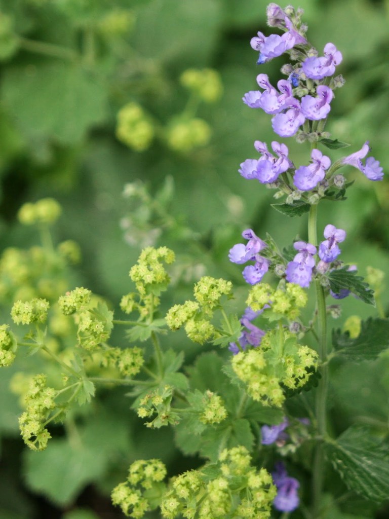
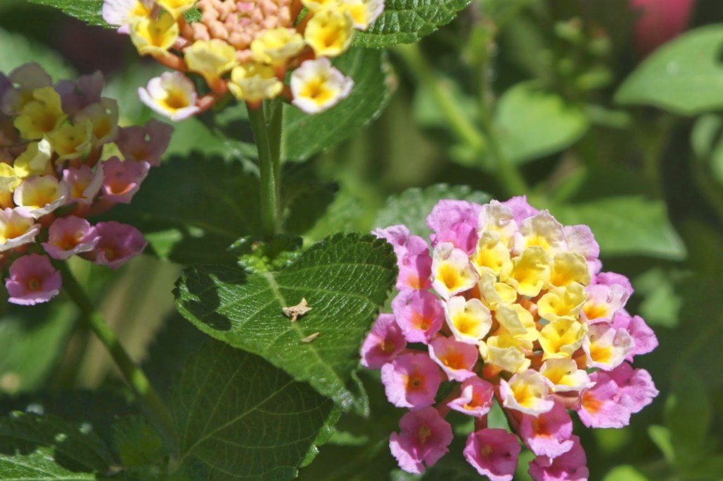
The most basic rules to the color wheel are that analogous colors work in combination and complementary colors work in combination. Analogous colors are those close to each other on the wheel. While colors in nature rarely match the wheel, orange/yellow and pink/violet are examples of analogous colors that work together. Complementary colors are those on opposite sides of the wheel such as red/green, blue/orange and yellow/purple. A mix of analogous colors will appear more gentle and subtle, while complementary will have significant contrast and make each color stand out.
As an example, if you planted Geranium ‘Roxanne’, Salvia ‘May Night’ and Ceratostigma together, the blues and purples will all blend together with none standing out, but if you planted the same Salvia ‘May Night’ with a ‘Happy Returns’ Daylily, both the purple of the Salvia and Yellow of the daylily will pop in contrast.

While this topic can expand into all sorts of areas, lets just focus on color. The most passive approach is to take color cues from nature. With native plants this can be very dynamic with regard to color and texture. Often people think that native means boring but that does not have to be the case. Echinacea purpurea has pale purple petals and orange seed cones as seen below. Oenothera fruiticosa has yellow flowers with red buds and stems.


When I think of the many uses of complementary colors I think of wonderful yellow/purple plant combinations, or the Christmas red/green colors. On the less attractive side I am reminded of the hideous New York Mets orange/blue uniforms or the worst combination, in my humble opinion, to ever hit the home and clothing industry of brown/turquoise.
But here is the rub, everyone is entitled to their own opinion, and others may like what I don’t. Once people have an understanding of color they can make their own choices. The modern day mother of color in the garden is Gertrude Jekyll, and for more on her life and work you can check out the website of her estate at Gertrude Jekyll. She was one of the first to really pay attention to color and texture when creating gardens and her work was an inspiration for later Impressionist painters. Combining similar colors and textures can create a soothing garden while contrasts in color and texture create more contrasting and noticeable elements.
There are so many more levels to using color and more complicated combinations on the color wheel, as well as discussion of hue, warm/cool and much more. My point in this post is that no matter how many rules and constructions there are, at the end of the day it should come down to what appeals to your eye. Go to a paint shop and ‘borrow’ a bunch of chips. Find colors and hues that really appeal to you. You can buy tester colors and put them on paper for a closer look.
Do you like hot oranges, yellows and reds but also like pastel pink and violet. There are ways to lay out plants to make a crazy combinations like this to work, but it involves breaking the rules, and I don’t care. When you realize that yellow, red and orange are warm colors that read energy and excitement, while purple, violet and blue are cooler colors that read calm and restful, you can start to create beds for any part of your garden.
I like color in my garden and my home, and that is my tendency while designing — to incorporate as much color throughout the season into gardens as possible. I don’t have a beige or white wall in my house, but I know that many people like simple color schemes or white gardens. Knowing what you like and sometimes kicking rules to the curb is the best solution.
The color wheel is an important place to start in any form of design, but it is important not to be tied down because you can always throw out the color wheel!
Thanks David.
